Made with: Figma
Chess.com Redesign
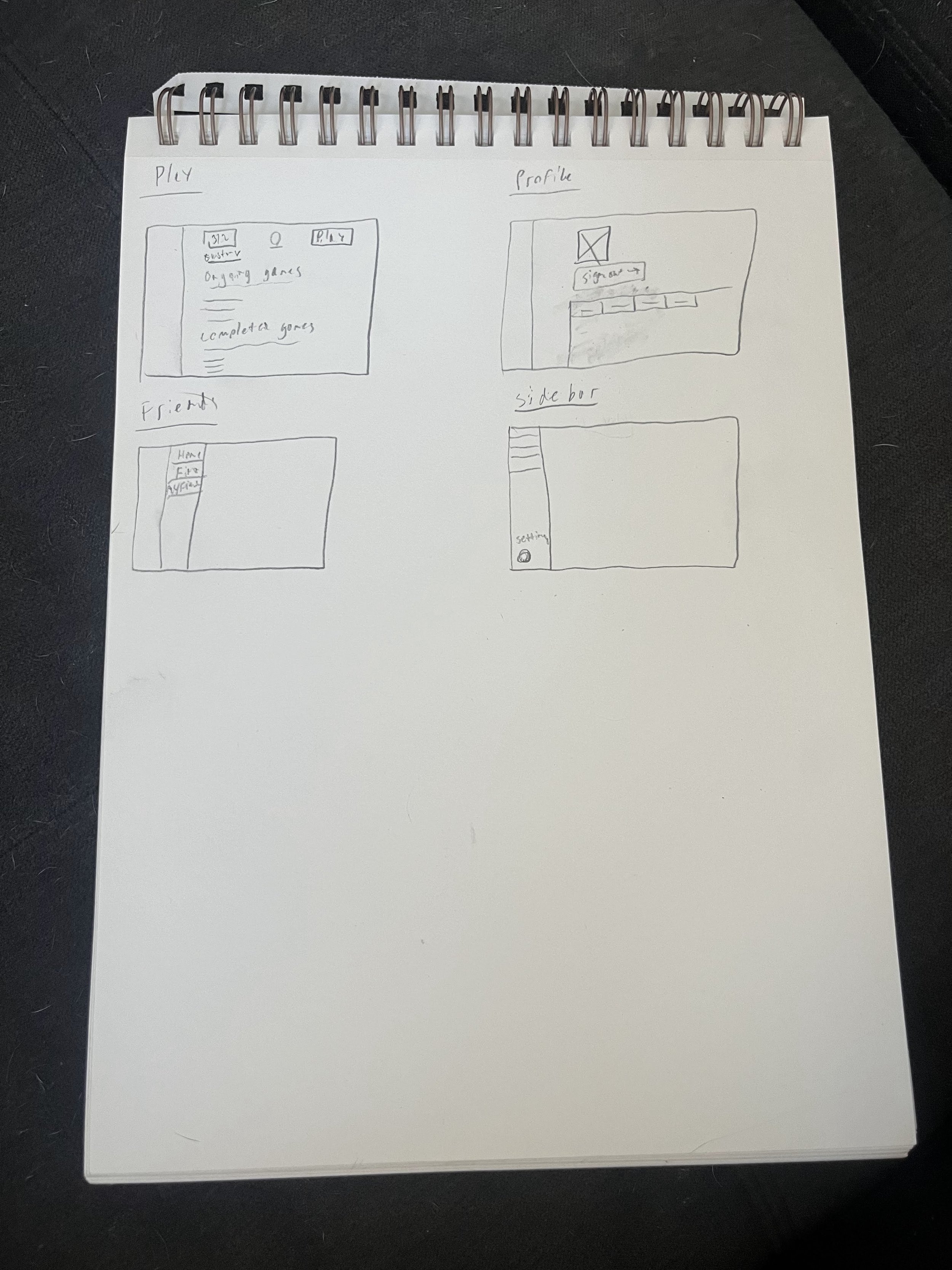
Chess.com has gained in popularity over the last few years, and as for myself, have become more obsessed with it. But now that i’ve used chess.com for a while now, i’v found it is not intuitive and hard to use. Tracking ongoing daily games is very confusing, seeing old games is hard to find, finding and adding new friends is tucked away in this “social” tab making it pretty weird and hard to find, and starting different types of games can be really hard to do. I wanted to take a stab at redesigning the flow of the page to make it more intuitive for users, and the following is my process on coming up with the redesign.
Things I’m addressing:
Profile Page
Sidebar Structure
Play page
Friends Page
User Stories
Look up a game I played
Want to play multiple games at a time
Save a game, and looks it up later
Play a game vs a human
Play a game vs a computer
Adjust my play settings
Log out
Find friends to play with


